The Saddest Thing I Can Imagine, Is to Get Used to Luxury

(left) dress PREEN by THORNTON BREGAZZI

(left) dress OTTOLINGER, shoes VIVIENNE WESTWOOD (right) shoes BALENCIAGA

bag PRADA

(right) total look OTTOLINGER


(left) bag BALENCIAGA (right) dress PREEN by THORNTON BREGAZZI

(left) dress JEAN PAUL GAULTIER x LOTTA VOLKOVA

(left) bathing suit OTTOLINGER (right) shoes BALENCIAGA

dress FLORENTINA LEITNER
Photography: Yves Borgwardt (@yvesborgwardt)
Styling: Saskia Schmidt (@saskia.schmidt)
Casting & Production: Juniors New York (@juniorsnewyork)
Beauty: Paloma Brytscha (@thisis_paloma) using BYREDO
Hair: Rabea Röhll (@rabearoehll)
Model: Emma (@emmagrass_) @Girls Club Management (@girlsclubmgmt)
Ascending to New Heights of Style
Ascending the New Height of Style
Embracing the elegance and functionality of skiwear with GIORGIO ARMANI Neve collection

It’s early March, snow on the Alps hasn’t melted yet. As the fashion week marathon and ski season draw to an end, GIORGIO ARMANI invited fashion editors, influencers, key opinion leaders and VIP from EMEA region to join them in Megève, France. The occasion is a three-day intimate experience to celebrate the launch of the Giorgio Armani Neve pop up store.
Opens from December 17th 2022 to March 26th 2023, the pop-up store in Megève is one of the three pop-up stores – other two are in Verbier, Switzerland and Courchevel, France – of the GIORGIO ARMANI Neve skiwear line. The opening of the pop-up stores was preceded by a runway show in St. Moritz last December, unveiling this season’s fashionable yet functional mountain-ready apparels and design accessories.
First introduced in 2021, the second season of the Neve collection does not only accentuate high-performance sportswear and outerwear; the chic and comfortable after-ski clothing is also a not-to-be-missed. With a visit to the pop-up store, guests had a closer look on this season’s proposals.


Aside from the store visiting, GIORGIO ARMANI invited its guests to partake in some mountain activities. Throughout the three days event, they experienced skiing, snowboarding and snowshoe hiking on the breathtaking landscape wearing the latest GIORGIO ARMANI Neve gears and attire. Exquisite delicacies and luxury champagne were served; and friendly dinners with magic shows were to entertain the guests. Everybody enjoyed a convivial and adventurous sojourn full of GIORGIO ARMANI’s remarkable elegance, leaving their most beautiful late-winter memories on the niveous ski slopes.


Event Photography: Valentin Le Cron
Text: Yves Tsou
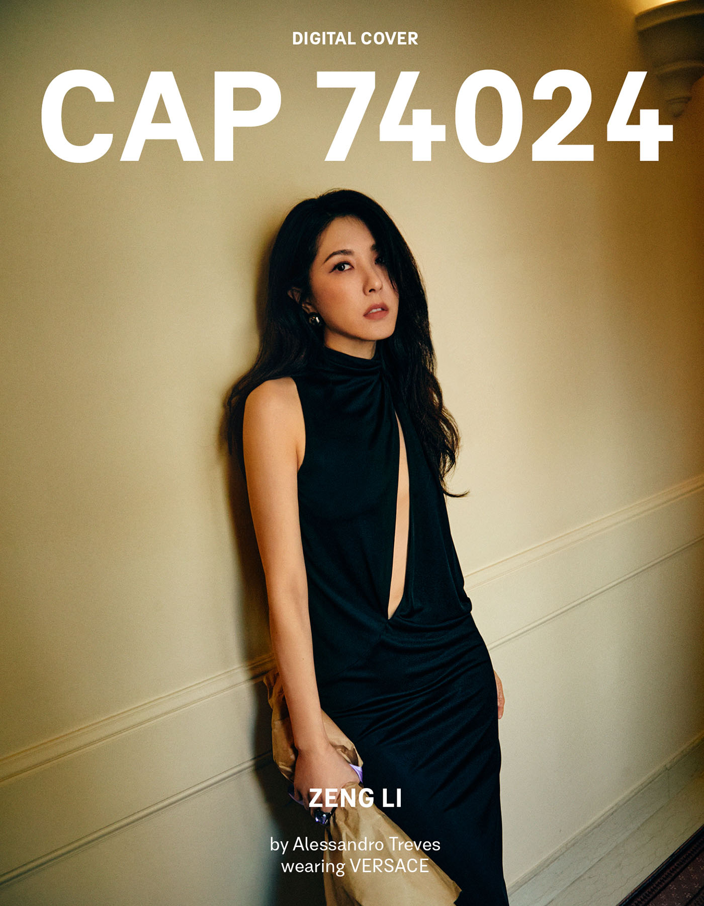
Zeng Li



BOOM TOWN: An Art and Digital-Centric Talk With Peter Burr

Influenced by the tools and aesthetics of video games, pioneering digital artist Peter Burr’s latest online exhibition BOOM TOWN is a richly crafted narrative world that is deeply evocative while remaining mysterious and restrained. Curated by Julia Kaganskiy, the exhibition displayed images and environments that hover on the boundary between abstraction and figuration, inviting the viewer to conceptualize their interpretation. In the exhibition, Burr’s compositions draw on generative dynamics and the complexity that emerges from simple, rule-based systems. Each piece in BOOMTOWN represents a unique, living artwork composed of 1,000 images that will change over time, evolving as a kind of durational stop motion animation over an undetermined period pegged to Ethereum’s block time. They all follow precise logic for generating the structure’s architecture, its ground and field, its shadows, planes, and colors.
Taking this precious chance to speak with Peter Burr, CAP 74024 talked with him on his concept, his artistic language and his latest exhibition. While we try to dig into the story behind his creation and his inspiration, we also want to understand Burr’s perspective on how art and new technologies like blockchain or NTF work. Here’s the digest of the talk we shared with him:
Hi Peter, we would like to start with your latest exhibition, BOOM TOWN. On the Feral File platform is a series of NFT / digital artworks that grow and change over time. Can you explain what readers are going to be experiencing with the work?
Each artwork is built with a little clock inside it that ages the piece as the Ethereum ledger grows. My hope is that the piece will last for 10 years and change multiple times a week over that decade. Will it BOOM or will it BUST? It’s not actually up to me… it depends on people continuing to use this technology and write things on that cryptic ledger to move it forward through its lifespan.
The works in BOOM TOWN have a certain nostalgic, “oldschool” digital quality, what was the intention there?
It all started about 30 years ago when I played this video game called MacPaint that was secretly training me to be a visual artist. It sparked my interest in painting which led to me exploring animation, installation, making my own video games, and now producing this project BOOM TOWN coming to life on Feral File.
A few years ago I fired up an emulator and started playing with Mac Paint again. It was exactly as I remembered, and within the constraints of this tool from 1984, I found something interesting. Despite the limited color palette, the lack of an ‘asset store’, the super simple interface – I found a voice to talk about some of my more complicated feelings around our current moment using a tool that was long ago left behind. I think the fact that this tool was so straightforward and familiar helped me discover that voice.
I think about this discovery a lot, because today we are in a world where technological advancements cycle faster than our minds and bodies can comprehend. As soon as a website or a software interface becomes familiar, I expect it will change. A system of updates whether or not we like it. I don’t see this stopping. In this world of “update hell”, I wonder if any of us will ever catch up. I don’t think anyone really knows. Perhaps the more apt question is… how do we build a better world from systems that change before we even learn to work through their shortcomings?
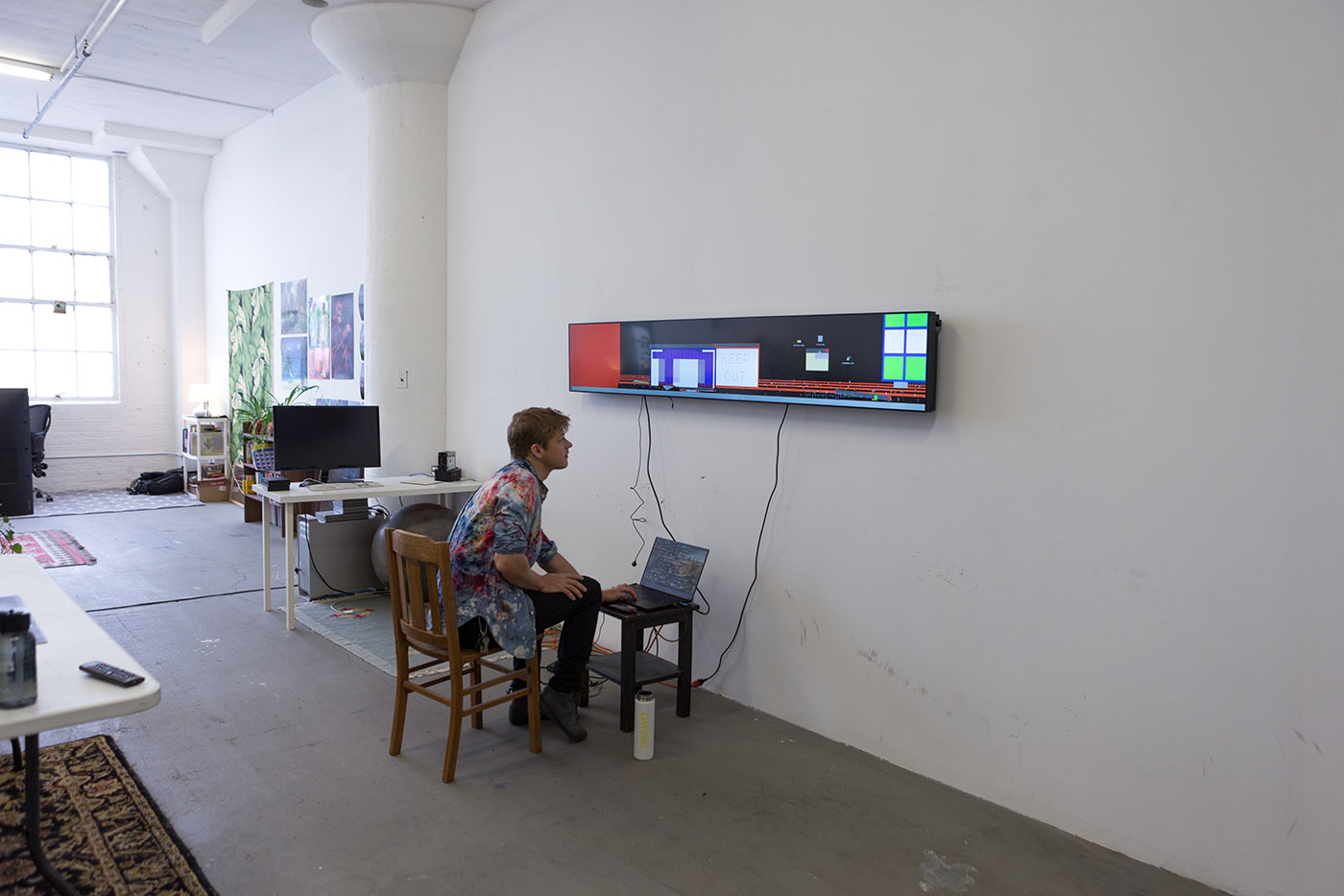
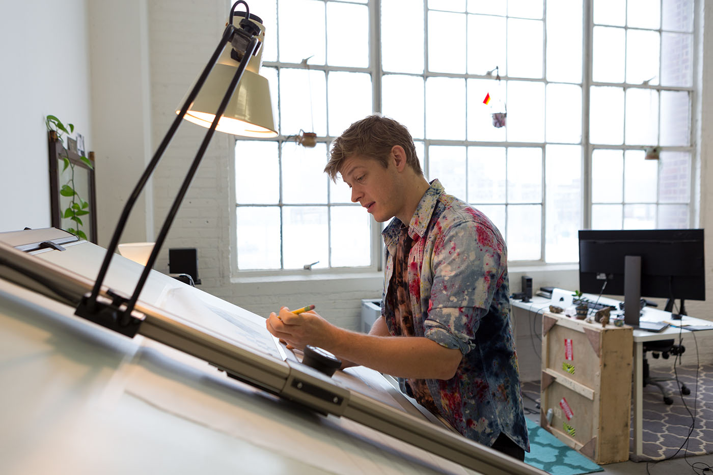
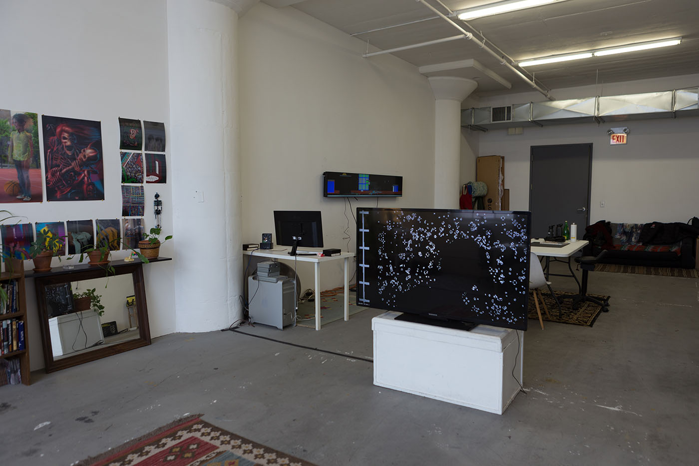
BOOM TOWN explores ideas like Manifest Destiny but translated to the blockchain and these new technologies. What inspired this?
I think Julia Kaganskiy, this exhibition’s curator put it well when she said “BOOM TOWN is galvanized from the landscape of the American West, when makeshift settlements, or “boom towns”, sprung up wherever valuable resources were to be found. Informed by the ideals of Manifest Destiny, colonialist expansion, and get-rich-quick schemes, these towns attracted prospectors, speculators, and those in search of a fast track to a better life.”
Architecture appears in your work quite frequently. Where does this fascination come from?
Architecture is interesting to me because it’s all this strange form of public art – expressive, symbolic, and practical at the same time.
Has blockchain and digital art shed a new light on your practice?
I like the idea of using social technology like blockchain tech as a space for collaboration. A few years ago I participated in a project conceived by Casey Reas called A2P that ended up being an early prototype of Feral File – working out the kinks of how this technology could work within our artistic community. It’s an honor to be able to bring BOOM TOWN into this space now that a few of A2P’s wrinkles have been ironed out and renamed.
Interview by CAP 74024 Team
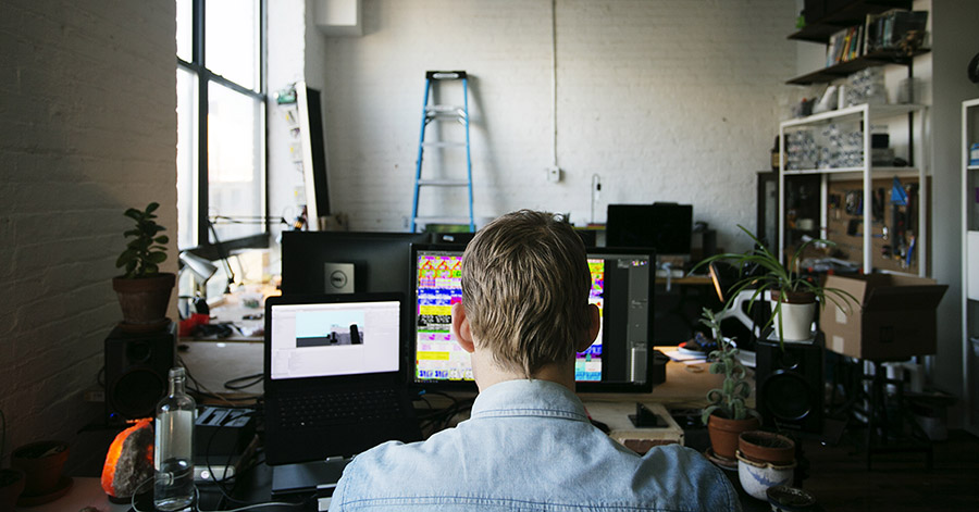
Selected works from BOOM TOWN
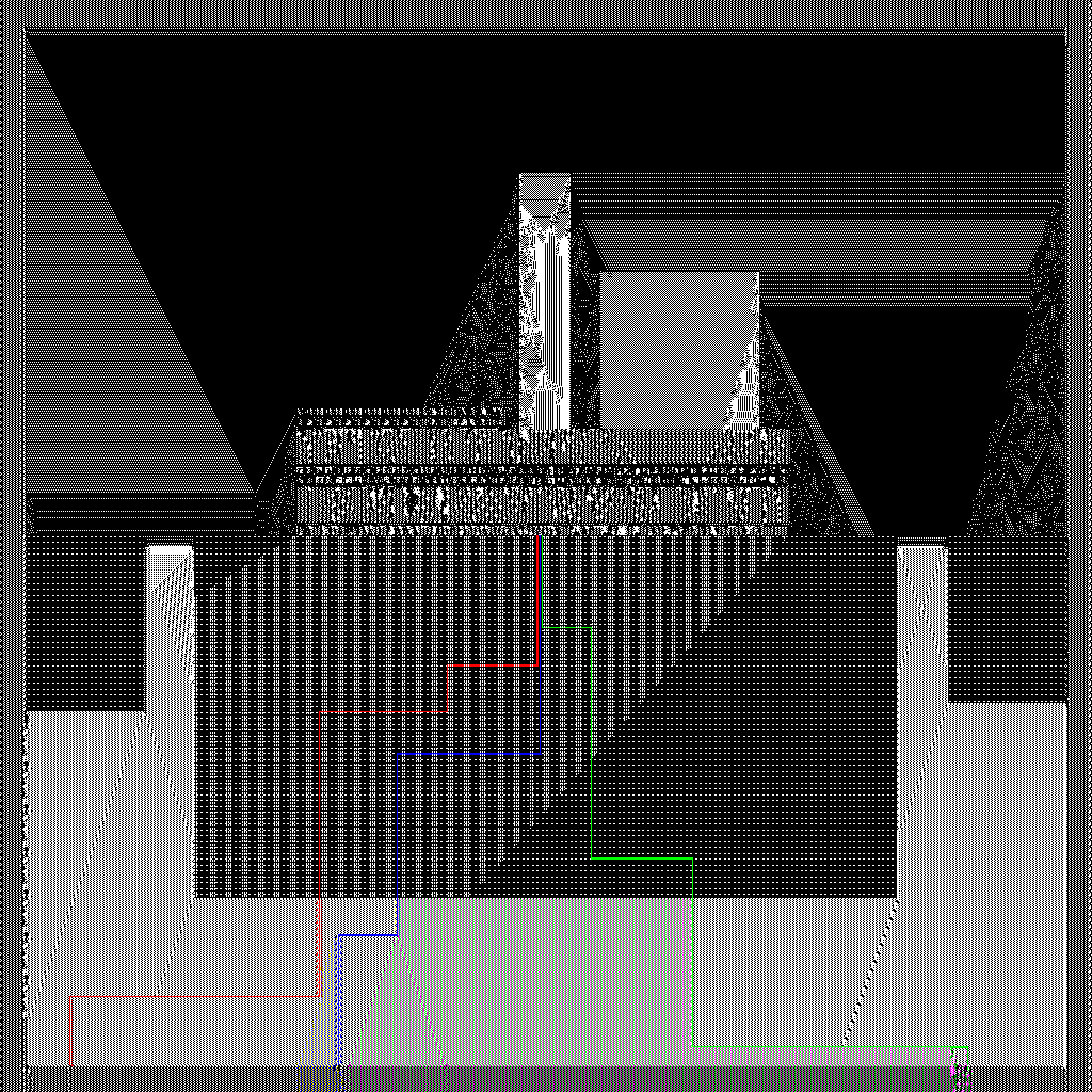
powerplant
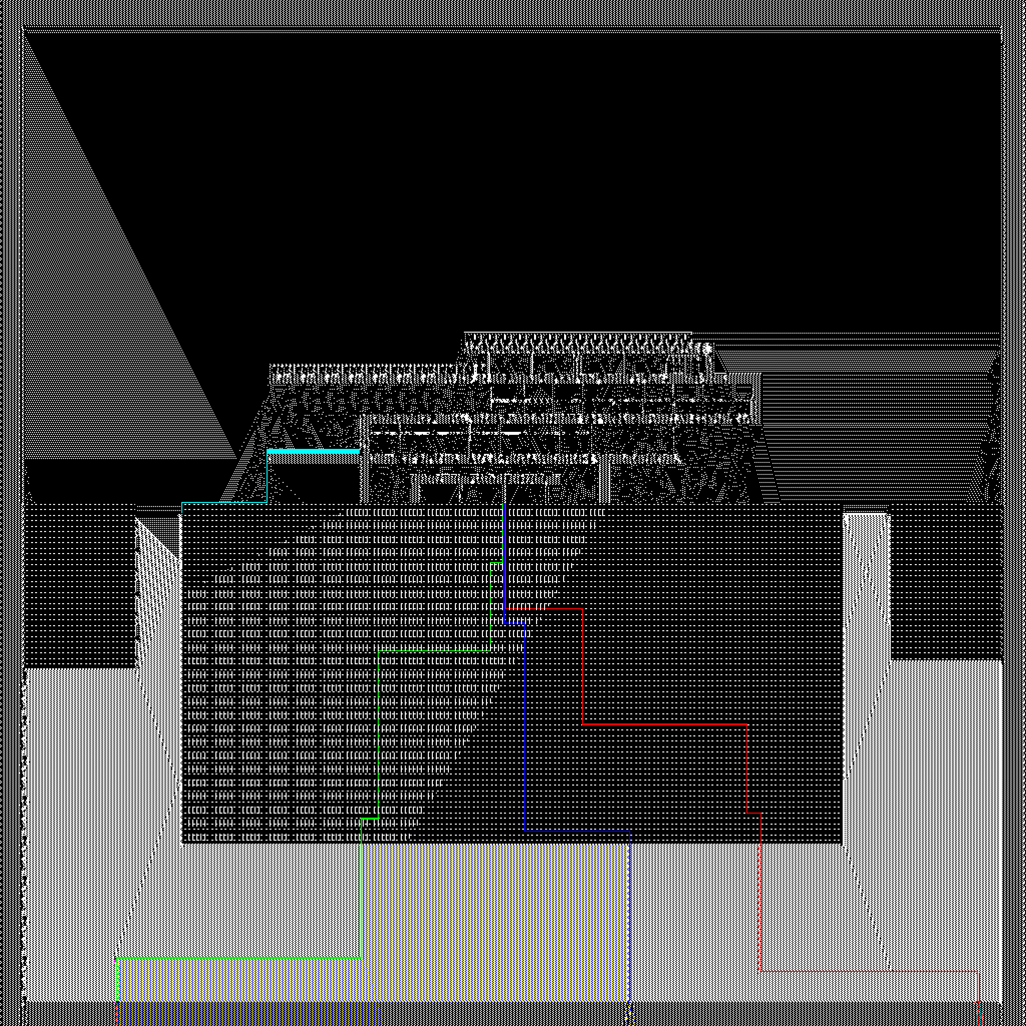
luxury
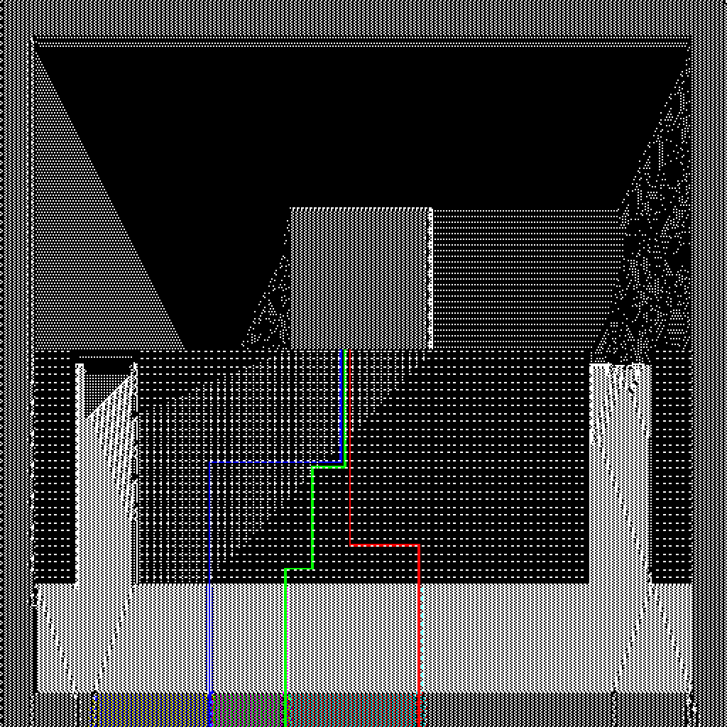
warehouse
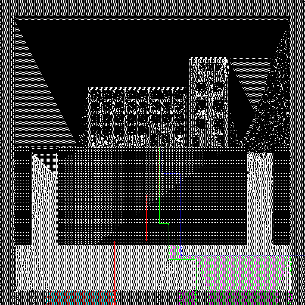
apt06
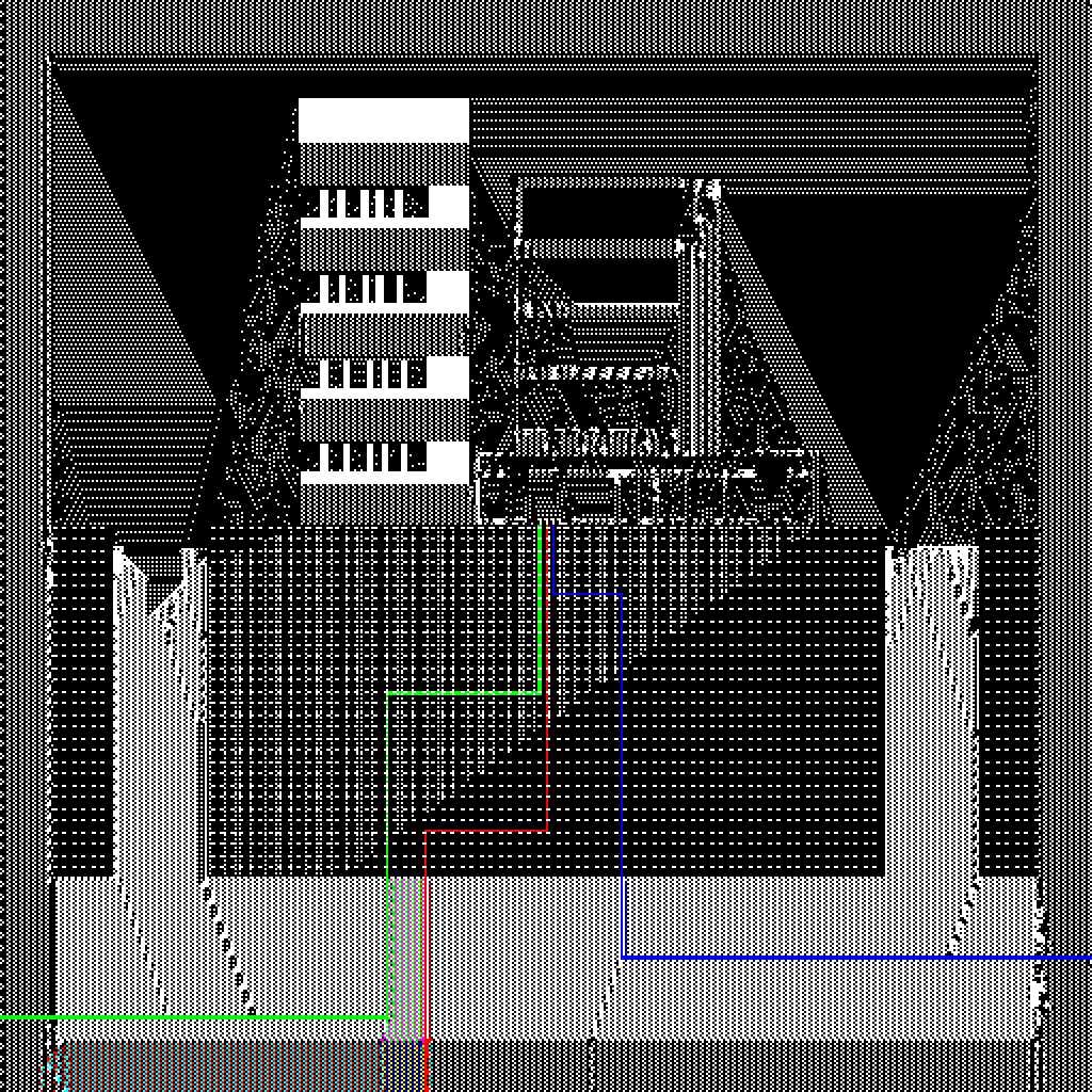
apt10

apt11
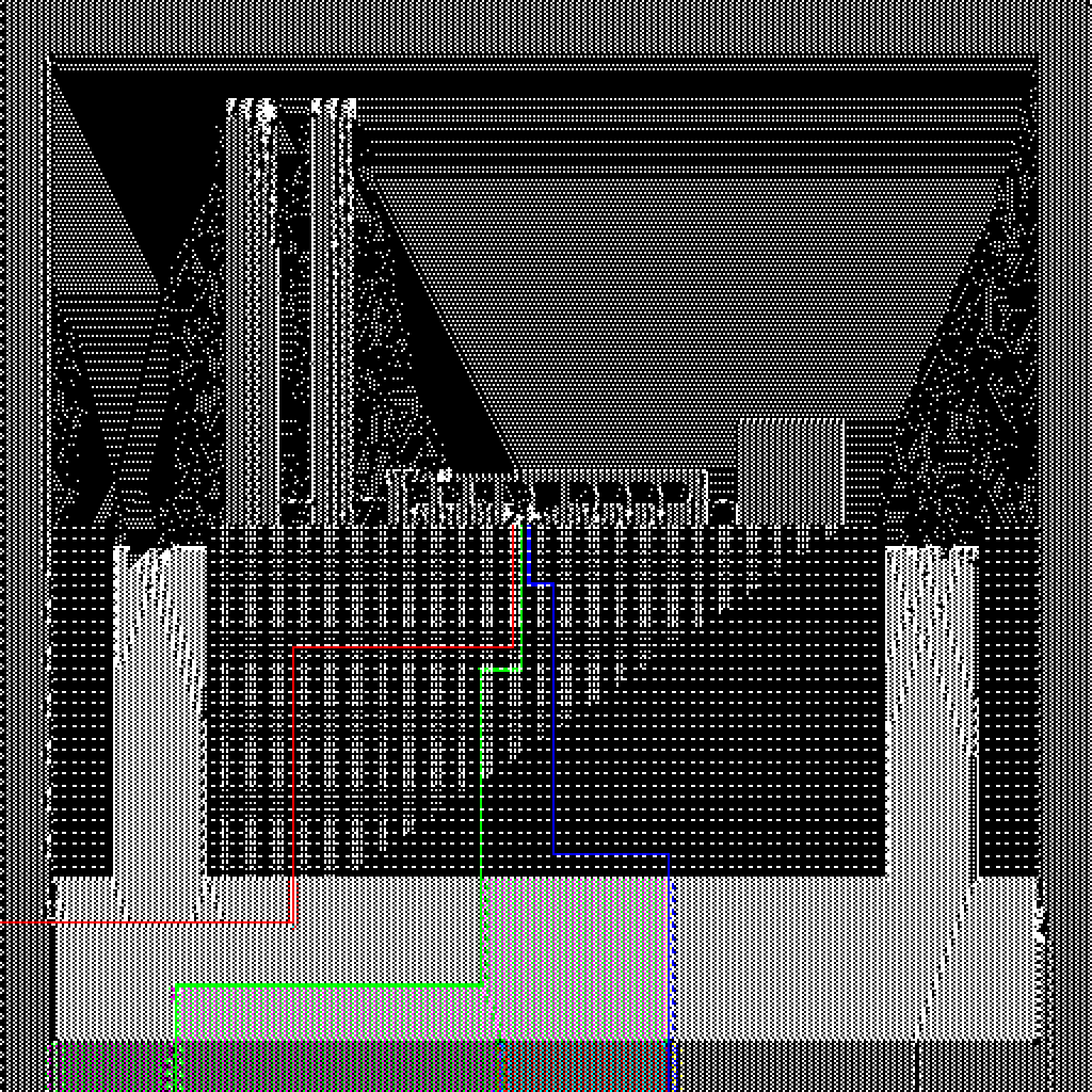
factory03
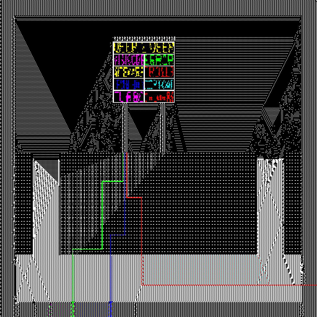
shopping06
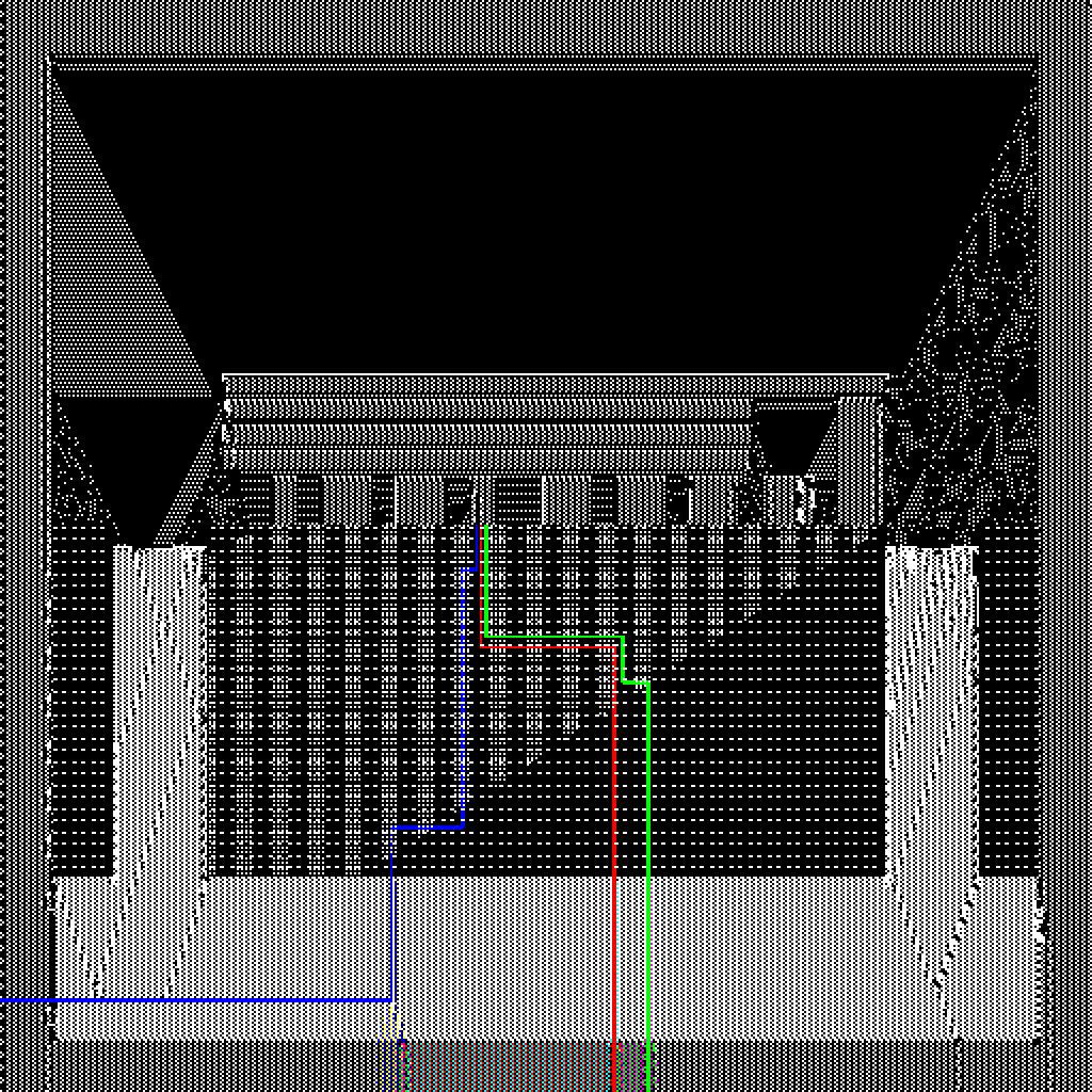
office02
A Portable Red Lipstick
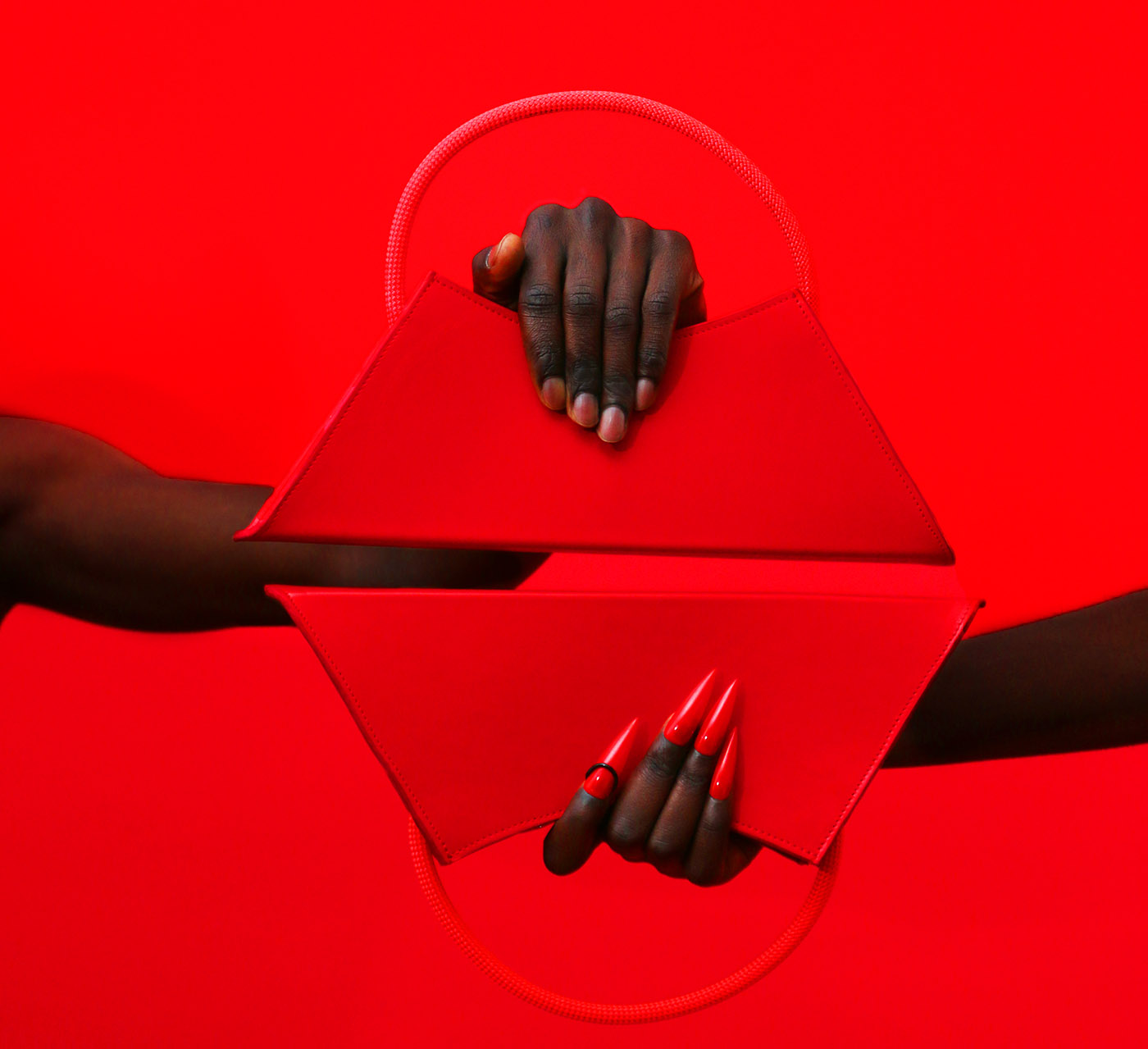
Born in Paris, the fashionable bag brand ASZPAK is known for its chic silhouette, bald color and clean design. Coming back with the Valentine’s special “Red Lipstick Bag”, the Dalí inspired baguette is ready to be the new “It-Bag” in your closet. Wanting to know more about the story behind the brand and its design, CAP 74024 invites the founder and designer of the brand, Alexandre, to have an intimate conversation with us.
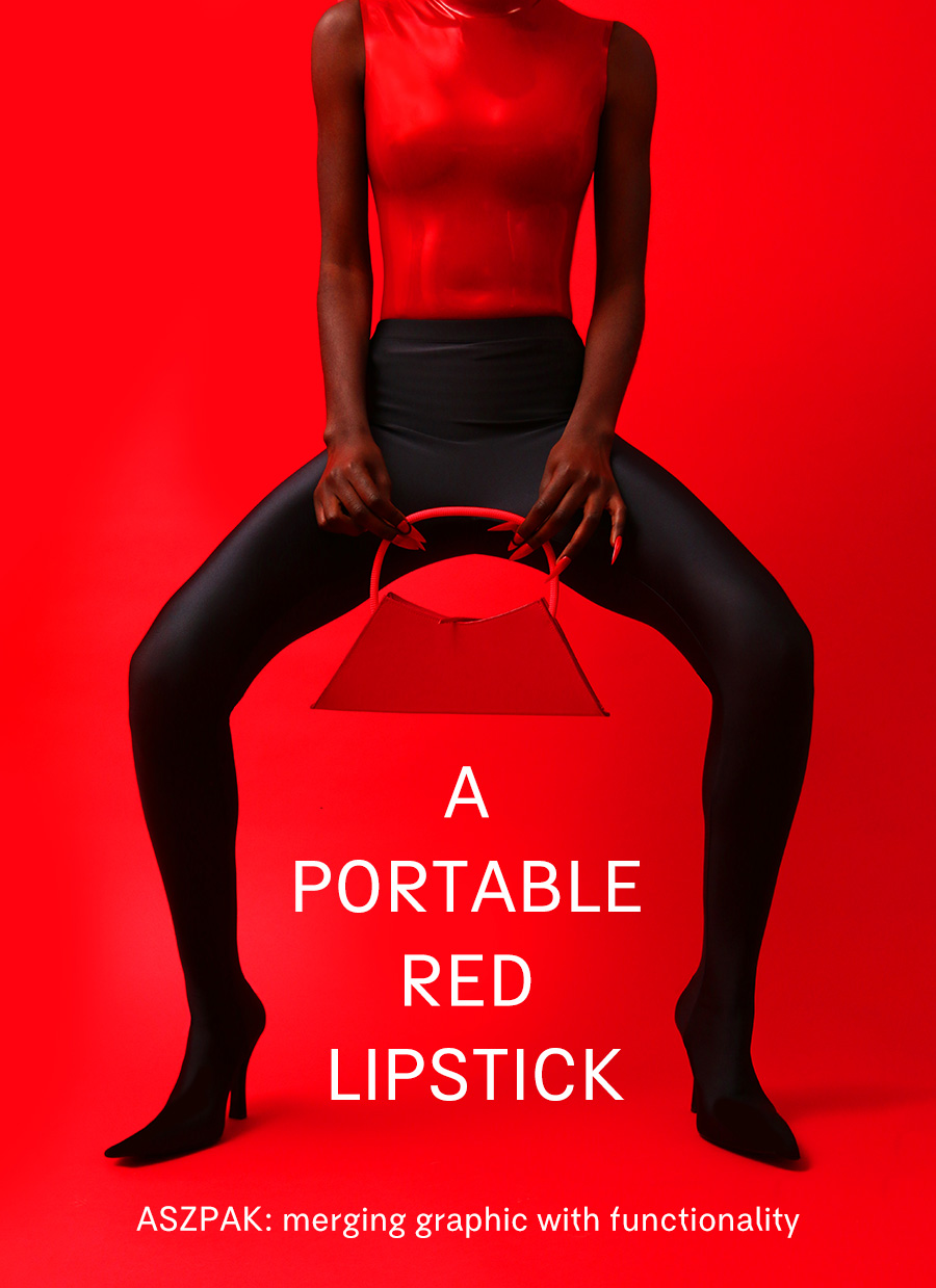
Could you tell us more about ASZPAK? What’s the story behind the foundation of the brand?
ASZPAK is a contemporary leather goods brand based in Paris. The origin of the brand is inspired by my mother’s surname: SZPAK and the first letter of my first name, Alexandre.
We are inspired by the digital culture of the 2000’s with a twist. Currently, we offer two geometric bags shapes where the handles can be switched and extended. I wanted to allow my customers to choose their design while keeping a strong concept and the integrity of my leather goods.
Why do you want to focus on bag design?
I have a background as garment designer and I have been making made-to-measure for clients. Unfortunately, the arrival of the sanitary crisis stopped everything. I realized that I had always been fascinated by materials, whether technical or “lively” like leather. And I thought it was daring to continue to combine them in a different way, to create an “interplay of materials and textures. Something new and different happened with leather because it is a material associated with a real tradition and craftsmanship that immediately fascinated me. Twisting these codes to make a more pop and playful object allowed me to give leather goods a different look. I would like to continue to revisit a collection of classic leather objects and update them for people of my generation.
Matching the rope handle to the leather became my concept and my signature at the same time. Moreover, it was important for me to not create another brand in the landscape. In other words, I wanted a more reasoned and simple creation with a minimal impact on the environment. I try to fight at my level against waste and to promote short chains. The leathers I use are unsold from big companies that are destined to be destroyed and they have a traceability that I communicate to my customers.
What are your visions of ASZPAK?
I now perceive ASZPAK in a more international perspective because our experiences in department stores and our international retailers confirm that the brand is in demand. We had the incredible opportunity to sell our products at Printemps Haussmann and this was an important turning point in the development of the brands. I approached the creation of my brand in a very instinctive way and it was by starting to create it by myself that I found my brand identity. I wanted graphics, geometry, simplicity in the way of carrying a bag, but above all to define a creative vision that would stand out with a strong and committed product.
There are so many big fashion houses and niche brands designing fashionable, interesting and wanted bags. What are the traits that make ASZPAK stands out from others?
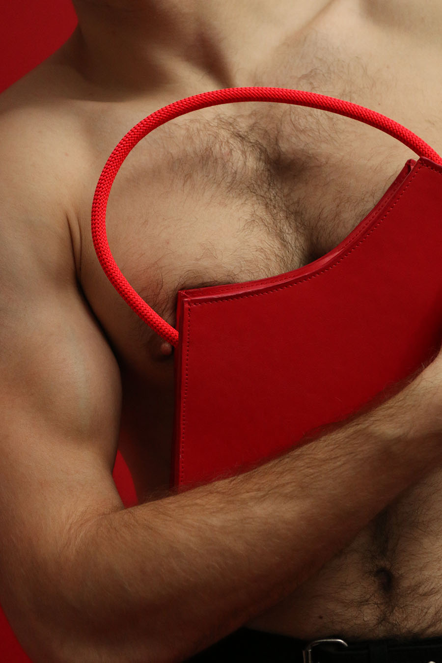
We distinguish ourselves from other brands because we prefer to work on permanent designs that are graphic and have a specific function. They are fashionable but always practical and functional. The design is permanent but the leathers change regularly because we have a limited sourcing. The goal is not to multiply a multitude of shapes but to focus on an iconic shape, a symbol and to play with the materials. I have noticed that each brand develops a symphony of symbols that allow it to be recognized in a blink of an eye and to differentiate itself. In this sense, ASZPAK’s symbolism consists of a leather base topped by a neon handle. The attention to material quality, the graphics and the pop colors are the starting points in the development of our collections.
Now let’s focus on your latest design, the Red Lipstick Bags (which also come in white…). Can you guide us through the design of it in details?
I wanted a red monochrome bag for Valentine’s Day! A warm bag that will highlight a winter silhouette. For this capsule I wanted to talk about love and sensuality through the color red but also to play with the curves of the bag that imitate red lips. Our bag is also available in white and soon in a large size.

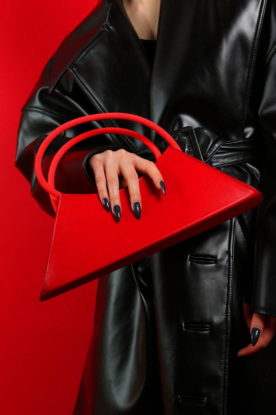
We learnt that the inspiration of the Red Lipstick Bag actually came from Salvador Dalí’s surrealistic Mae West Lips Sofa, but what draws you to take this reference as an inspiration?
I started to get interested on this reference last summer. I was in Mexico City this summer and I had been impressed by the brightness of the colors of the city and the food. I think it was this that inspired me at first to focus on very intense and less folded colors. Then I went to an exhibition about surrealism in a museum downtown and I came across this sofa designed by Dalí. Reading about its design and history, I discovered that this sofa is a tribute to the mouth of Mae West. It is both a tribute to this powerful woman, and for me, an essential part of the design history. I was interested in playing with this symbol for an editorial and referring to it.
Do you often take inspiration from art and furniture design? What are other sources of inspiration you have?
Design and art – especially painting – are my primary sources of inspiration. Traveling allows me to be surprised, especially in terms of feelings. I think that yes, unconsciously or not, I am often inspired by the design of objects, it is often a starting point for a form or a boldness. I looked a lot at designers like Memphis design or Oki Sato.
Aside from the Mae West Lips Sofa, what are the other inspiration and references you have in your accessories design?
Shiro Kuramata’s designs such as the Progetti Compiuti chest of drawers and Charlotte Perriand’s boomerang desk are sources of inspiration, I like the way they question everyday objects and transform them into manifest and graphic pieces.
You mentioned about using deadstock leathers and recycled fabrics. In today’s world, many designers are doing so and sustainability is repetitive concept in many design. From your perspective, why is making eco-conscious design this important?
Eco-conscious design is important for me because it is now a real stance and awareness. Even if everyone tends to think that recovering excess materials and reusing them has become normal, we must remember that the storage areas where we pick up our materials, destined for mass destruction, is a consequence of an intensive production system. I do it and it is still not enough… that’s why we should democratize it all together! Our generation has the duty to do what is necessary and to use what exists, therefore it is important to shout it loud and strong!
The eco-consciousness does not stop at the supply side. It’s a matter of working with responsible materials but also of awakening a consciousness in design and production methods. Promoting short circuits is also something to think about, I make my bags in France, I get my supplies in France etc… We also have to be aware of how our bags are made, in what context and in what quantity. The goal is to create a movement and it is good news that things are moving in that direction.
We also limit our bag references and prefer to focus on one or two designs that work and incarnate the identity of the brand. I must admit that it is an easier exercise for leather goods because the bag goes through the trends more easily but this observation must also be infused in the ready-to-wear that until today continues to multiply the references, sizes and quantities despite the wishes of a more responsible sourcing.
What are the future plans for you ASZPAK?
We want to continue this dynamic and I believe that 2023 will be a great creative year with great business opportunities. We will be at Première Classe for the first time in March and we will exhibit our new designs. I would like to continue to rethink leather goods in a contemporary way and imagine new accessories. I simply dream of being able to continue to have the freedom that my profession allows me. To continue to transmit my energy and my ideas through my designs.
Photographer : Florian Cros (@floriangc_)
Stylist & Art Director: Léo Rouault (@leorouault)
Make-up : ThomyK (@thomykmakeup)
Nails : Magda S. (@nailsbymagda.s)
Models : Chris (@chrisilentus), Stas (@sslaventiy), Giuli (@giuli.pingitor), Kaba (@real_kaba), Binta, Bobby (@30337.6)
Interview by Yves Tsou
Moon Under Water




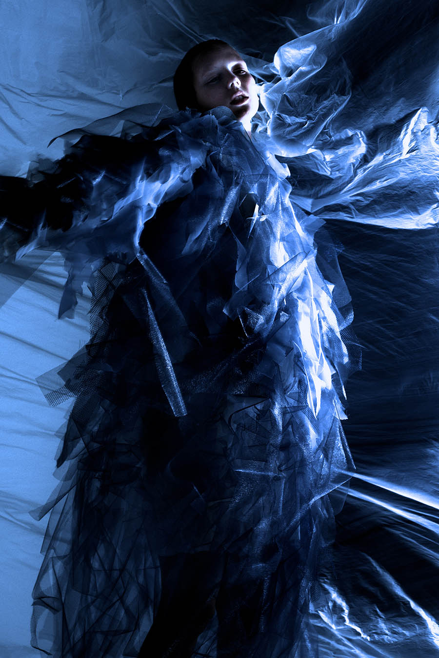







Photography: Luis Carmo (@luis.carmmo)
Styling: João Bengala (@obengala)
Make-Up & Hair: Marlene Vinha (@marlenevinha)
Model: Maryana Tsyutsyk (@pasteldechata)
Location: Vice Versa Studio (@vice_versa_estudio)
Special thanks to Kika Montenegro (@kikamontenegro_) & Fábio Silva (@fabiodrsilva)
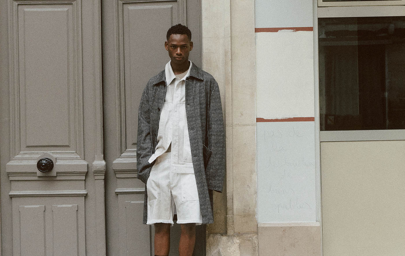
Belleville, 75010
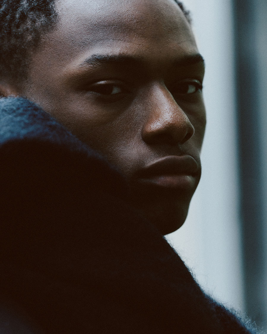


coat & shoes COMME des GARÇONS, pants vintage, scarf RUSLAN BAGINSKIY

shirt & jacket PAUL SMITH, pullover MM6 MAISON MARGIELA, pants PRADA, cap RUSLAN BAGINSKIY


top, shorts, denim jacket & shoes FENDI, socks PRADA

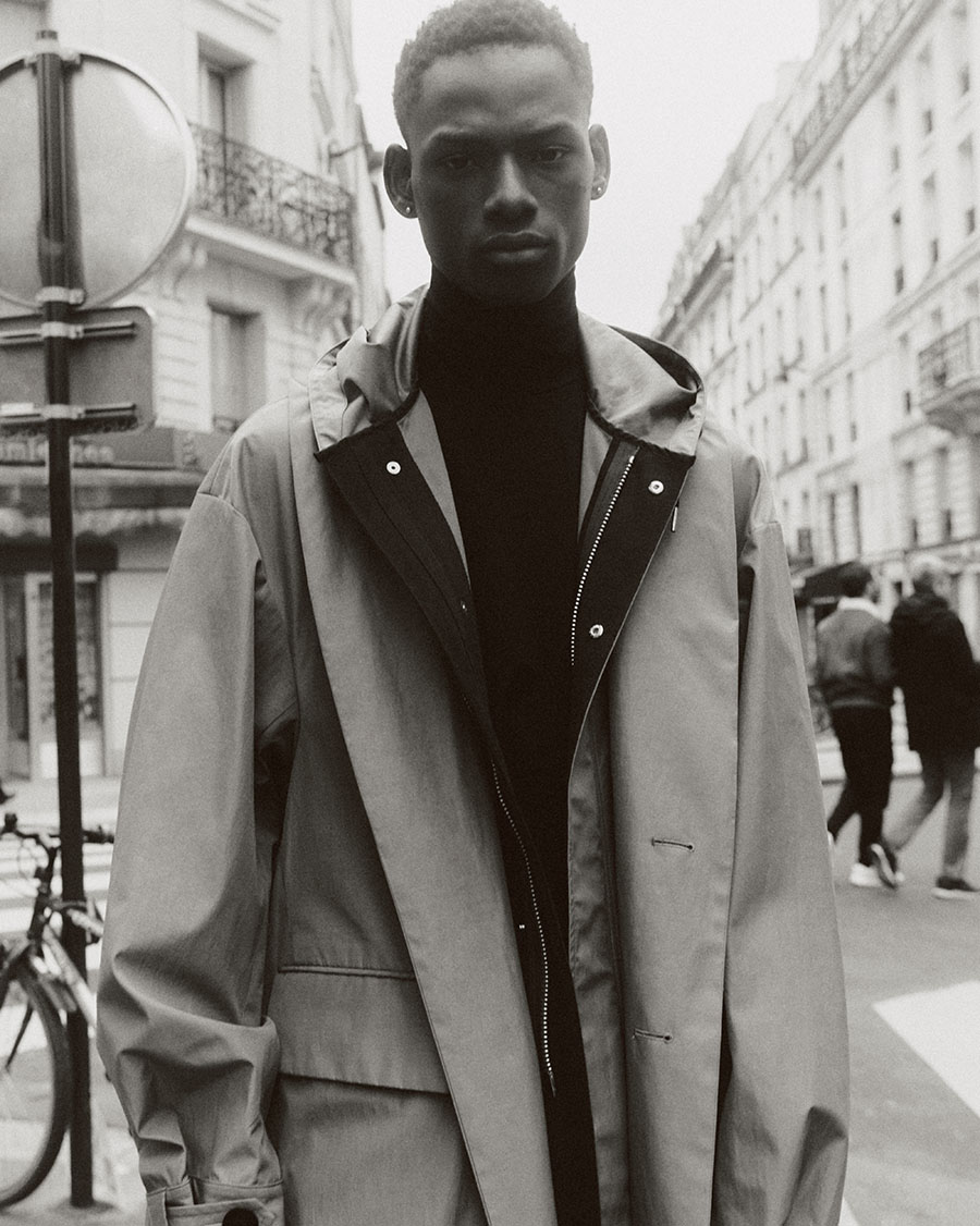
pullover MM6 MAISON MARGIELA, coat SACAI, pants PRADA

pullover PRADA, suit VIVIENNE WESTWOOD, leather jacket SAINT LAURENT, clogs FERRAGAMO, cap vintage

knitwear JUNYA WATANABE, denim jacket, shorts & socks PRADA, scarf AMI PARIS

shirt MM6 MAISON MARGIELA, vest & jeans KENZO, cap RUSLAN BAGINSKIY


Photographer: Paulina Wesolowska (@wesolowska_paulina)
Stylist: Karla Gruszecka (@karlagruszecka)
Producer: Karolina Varva (@karolinavavra)
Retoucher: Hue Retouching
Model: Godwin Alwell Okereuyu (@alwellgodwin_official)
Compersion
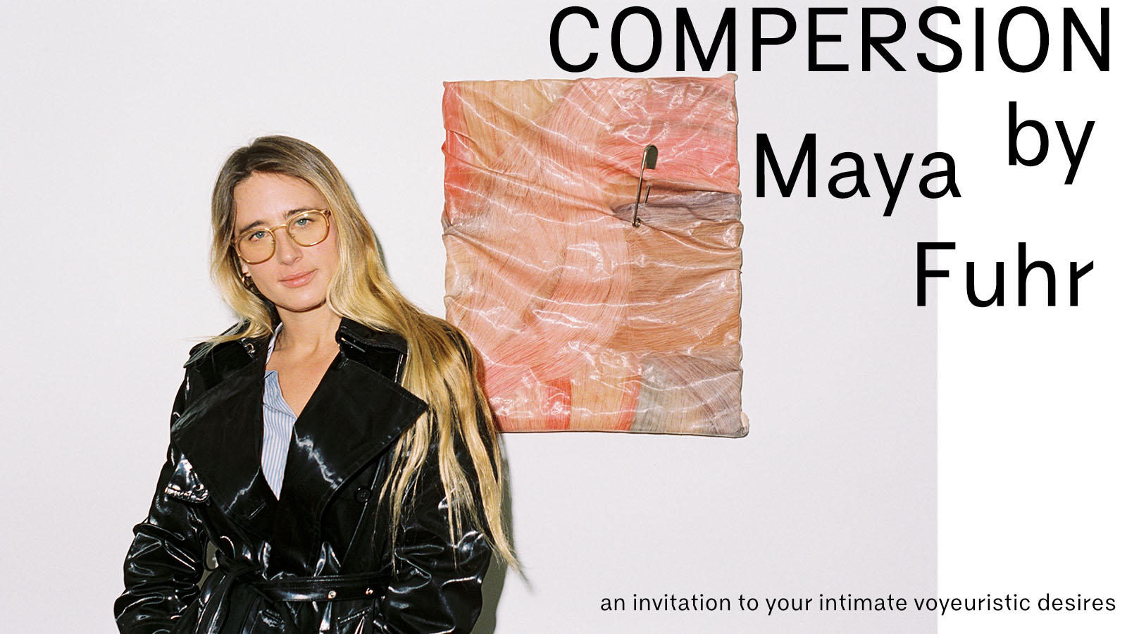
COMPERSION (noun): The gratification we feel for somebody else, even when their positive experience does not involve or benefit us directly. This is not just an uncommon word coined to describe some kind of feeling by someone some decades ago; it is also the title of Los Angeles-based artist Maya Fuhr’s first U.S. solo exhibition. Having just finished a joint-exhibition with some local ceramists and artists in Aldo Chaparro Studio in Los Angeles, Maya delve into the preparation of her solo exhibition straight away. With only one day to the opening of her exhibition, CAP 74024 is here speaking with Maya about her concept, her artwork and her journey on the creation of the sensational yet sensible exhibition Compersion.
Hi Maya, thanks for taking time to with us! How’s your day?
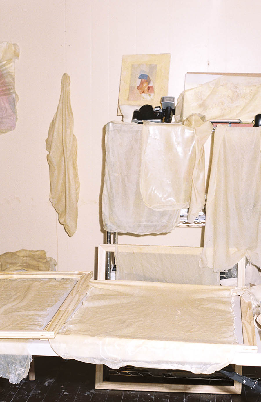
Hi, thanks for asking. I’m good – I put some oil in my car this morning and noticed the white flowers have blossomed on the trees on my street, and now i’m painting with pink latex. I just made a new batch. Feeling replenished and refreshed this morning!
Glad that you had a replenished and refreshing morning! It’s such a lovely way to start your day by doing things you like and having some cute little discoveries that makes us feel happy and blissful. As you mentioned about you had just mad some pink latex painting this morning, we would like to know more about your art! You have just participated in a joint exhibition Ceramique with other artists, with the aim to fund the non-profit project CLAYDD. How did the exhibition go? How was the experience?
The exhibition was super successful, we raised money through art sales to enable us to continue our workshops in the special education programs in L.A schools, and benefiting kids with mental health struggles and special needs. Without the generous donations from the art community, this wouldn’t be possible. It was also a really great way to celebrate the team of CLAYDD and all the artists we love – space is so important. Galleries have the ability to really act as a safe space to bring people together.
I’ve only lived in L.A for 2 years, so it’s been cool to meet a lot of talented artists – Mostly Chicano and beautiful people working with ceramic medium. Community is a huge pillar to my work and Ceramique was a beautiful experience, bringing people together through mindfulness, art, and collectively making a difference in the world. Doesn’t get much better!
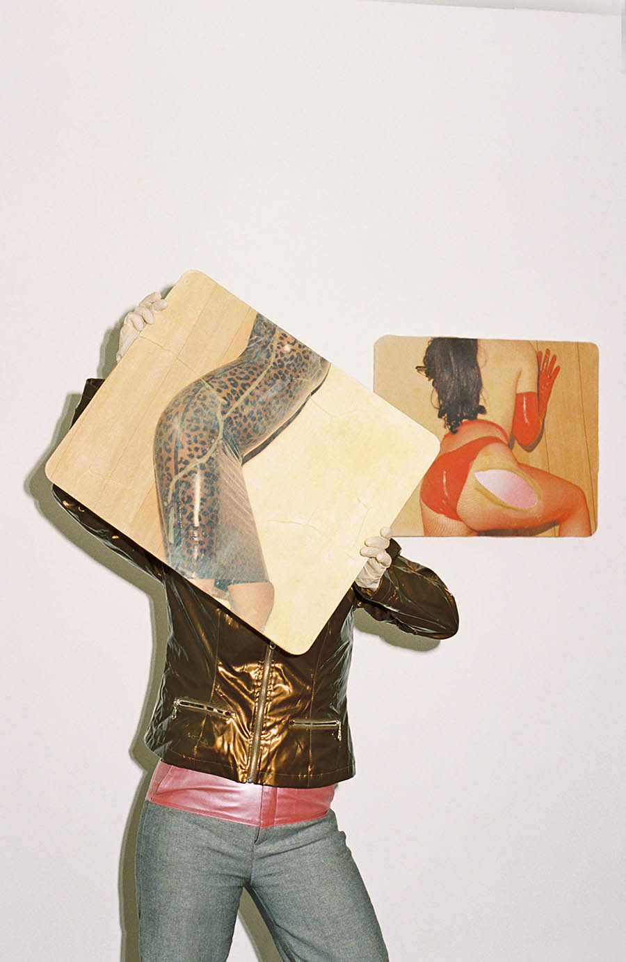
In your upcoming solo exhibition Compersion, you talked a lot about sex, intimacy, voyeurism and desire. Where does this idea come from? And how do you unfold your concept/plan?
Compersion has been quite the process exploring my own desires and stepping back to look at my photography career and this voyeurism that i’ve had permission to develop over the years.
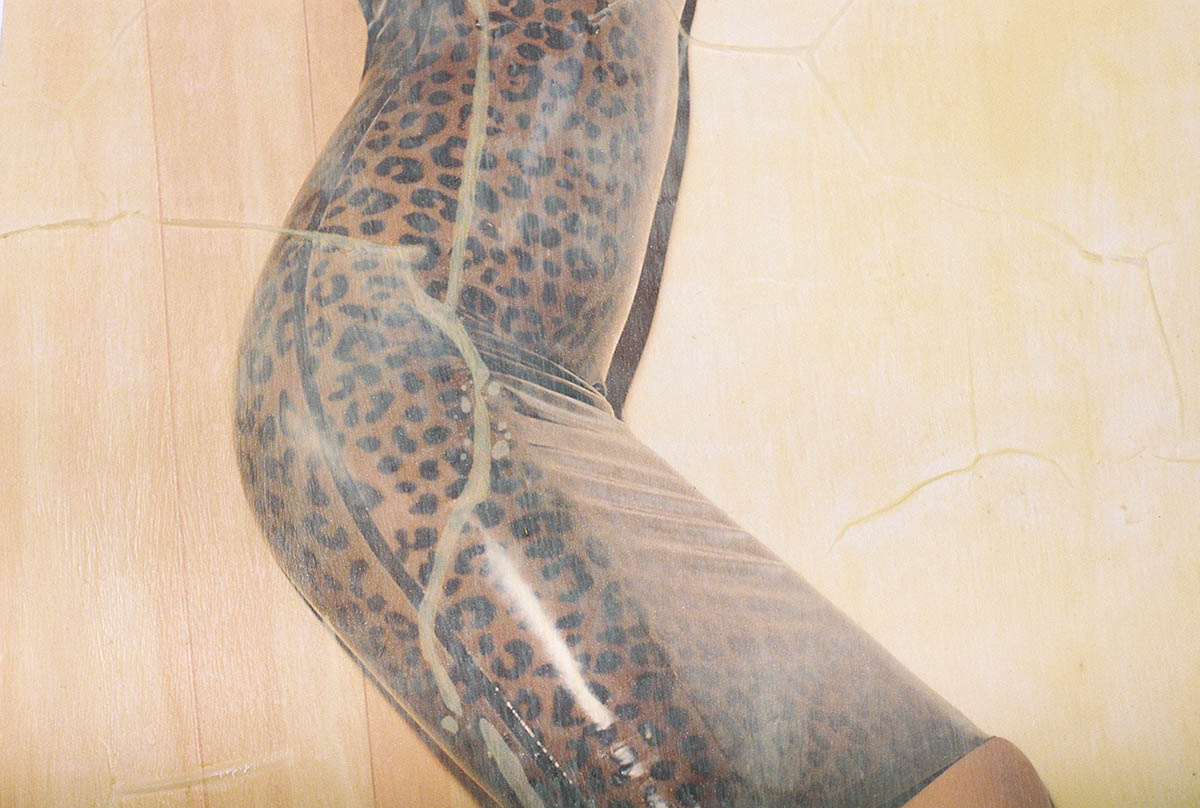
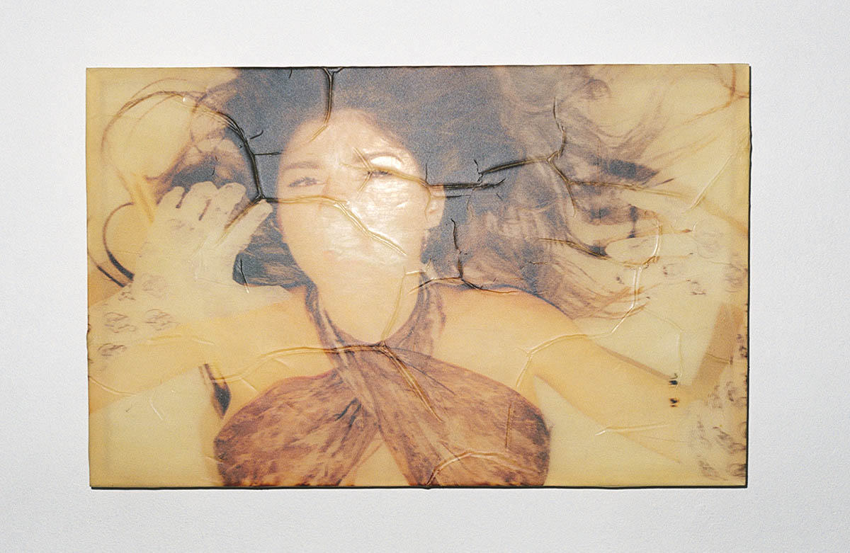
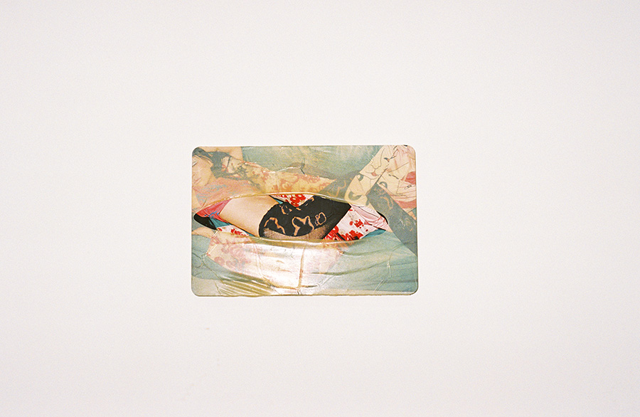
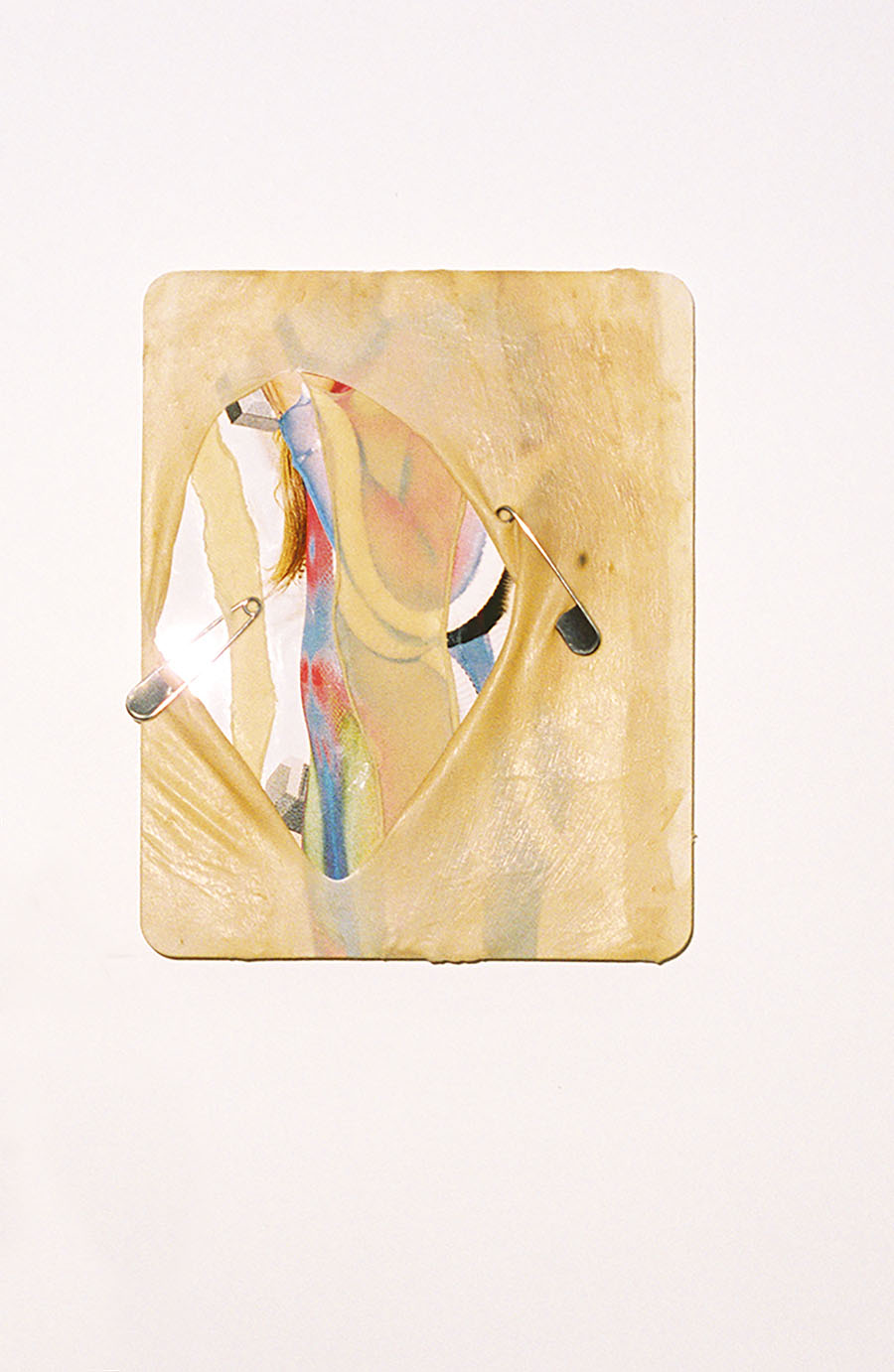
It’s hard to put how I measured it into words – but it started with my photography and the amazing opportunities i’ve had to photograph pornstars, sex workers, celebrities and latex brands. Connection gives me purpose, and I connect with my subjects through the lens. This body of work was a chance for me to get connected with myself again. My studio is in the garage of my house and I felt it was where I belonged. Exploring my obsession with latex, my relationship to subjects in my photographs and my intimate desires that I haven’t truly let myself be seen. I joke that this exhibition is kind of like retreating back to the womb, back to a comfy, safe place. The feeling of latex resembles this womb world. It’s a second skin, secure, personal. I had so much fun with the complete process, and now I want to share it with people and see what “compersion” they can explore for themselves after seeing it.
Even to this date, male gaze is rooted in our society and in the history of art. We’ve seen a lot of female artists talking about sex and reinterpret women’s body from their perspective. What are your thoughts about this trend and transformation? Do you think that female gaze renders a different perspective to the male gaze? What do you see in sex and women’s body when you look at it?
You know, when I started out my career in the mid 2000s, it was in a very trendy time of a new wave of feminism inspired by the young female photographers that were working, and i’d always be asked these questions about being female and I never knew how to answer them. I was confused about how being a female had anything to do with my work. It’s not until I got older, I’m 33 now, where I’ve had time to really be with myself and get to know myself as a human and woman. I now get that vulnerability is grounding, and it’s uncomfortable sharing that side of myself with the world – but it’s easier now to put it into words. I can’t see sex and woman’s body generally – we are all so different, but what I can speak from is my own personal experience being this woman and having this body. The male gaze does not complete me, being turned on doesn’t depend on it either. What reinterprets my body from my perspective is feeling sexy, it’s “compersion”, it’s through what I get to wear on my skin, it’s through breath, it’s through all these things that I didn’t learn growing up being a young woman. Hence, I navigated my sexuality and my body on my own, aside from how other people viewed it. Girls can be told their imperfect, educated about their body and how to pleasure themselves: I hope there’s a future of that. For this exhibition, I’m partnering with Non-Profit Centre for Positive Sexuality that is committed to research and sex education on this.
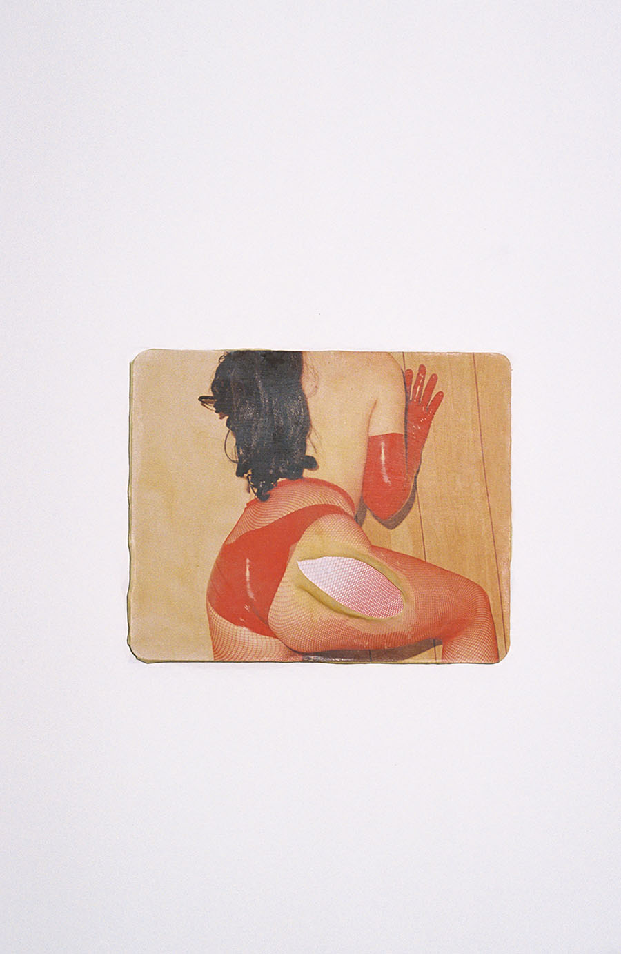
The title Compersion isn’t a frequently used word and concept in English, what was the reason you title your exhibition with this word, and what is the story behind it?
Compersion is a Buddhist practice that we can all learn from. By definition it’s a wholehearted participation in the happiness of others. It is the sympathetic joy we feel for somebody else, even when their positive experience does not involve or benefit us directly. Thus, compersion can be thought of as the opposite of jealousy and possessiveness. The poly-community coined this term about 40 years ago as feeling of joy from others’ pleasure, specifically celebrating your partner(s)’ other relationships in a polyamorous structure. My goal is that people can experience this feeling at the gallery, by interacting with the work and watching other people. Some of the subjects in the work are dominatrix, porn stars, drag queens – and in a way, their work allows for compersion. I’m inviting people to ask themselves what they could discover from compersion?
In this exhibition, you invite the viewers to interact, or to say touch, your sculpture for the investigation of their inner voyeuristic desire and intimacy. What was the concept and idea behind this design? Is there any expectation you wish the viewers to achieve or gain from this interaction process?
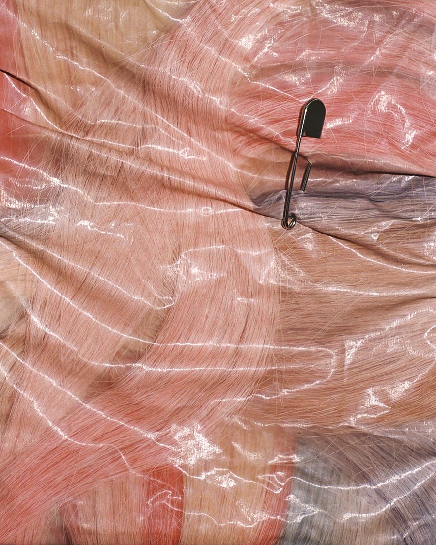
Latex is such a tactile material. I personally get so much joy from touching it and wearing it, but it can fulfill different desires for people that aren’t just directly visceral. For example, doctors wear gloves, there’s a distance between them and the patient. There can be a forbidden quality too. Latex can be skin-like, satisfying; and it also has a clinging protection. I’ll be providing pink surgical gloves and oil so some of the pieces can be felt. I’m curious to see what different people will get out of it. It’s not just sexual, it engenders healing. There’s also an inflatable piece called “Pony Tail” that I collaborated with Rat Studios on. You can touch the artwork, walk under it and be transported into another world of escape.
After hearing so many interesting stories about your exhibition and your artworks, we are wondering what are the messages you want to convey behind your art?
A safe space to explore desire.
If you can conclude the exhibition with one sentence, or even more, in one word. What would it/they be?
COMPERSION!
LOL! That’s indeed a very succinct, simple yet the most punctual word to describe your exhibition. Thank you for taking time to have this talk with us today. Would you mind sharing some of your future plans with us? In artistic creation or personal growth, we’d like to hear everything you’d like to share! 🙂
I’m looking at a special art residency in Mexico City, my latex work has just begun and I’m excited to develop it further. I’m also collaborating a lot within the non-profit CLAYDD and further growing our team, with lots of more meditation and clay workshops to come!
I’m going to camp more because it’s starting to get warm in L.A, and I usually travel with my photography work – so who knows where that will take me. All in all, I’m taking on being present, playful and trusting. Making sure i’m enjoying the experience along the way, and not thinking tooooo far in the future. 😉
Interview by Yves Tsou
Martial: Here to Break the Gender Binary
After unveiling its first collection of high-end, degendered swimwear in July 2022, Paris-based label Martial reveals a pre-collection that sets the tone for summer 2023. What is degendered swimwear and why is it important to have it in today’s society? To better understand these questions, CAP 74024 invite the designer and the head of Martial, Martial Charasse for a decent talk about his concept, his design, his journey and the stories behind them.
Could you tell us a bit about Martial? What’s the motivation behind founding this brand? Is any interesting stories or anecdotes you want to share in this journey?
First of all, before being the name of the brand, Martial is my first name. That of a child born on an Auvergne farm that is passed down from generations to generation. I have always felt out of step with the agricultural world in which I grew up. Preferring to imagine doll clothes rather than accompanying my parents in the fields. This is why after I graduated from high school, I decided to move to Paris to study fashion so as to realize my dream, to create my own brand.
It was after my participation in the Hyères Festival, and the numerous people I met there, that everything began.
An anecdote? I accepted a job as a swimwear designer in 2020, on the other side of the globe (Madagascar) without knowing anything about swimsuits. At that time, I found it exciting to go on an adventure, I had no idea that I would have real crush for this kind of product. Unfortunately, the pandemic miscarried this project, but my desire to create my swimwear brand was born.
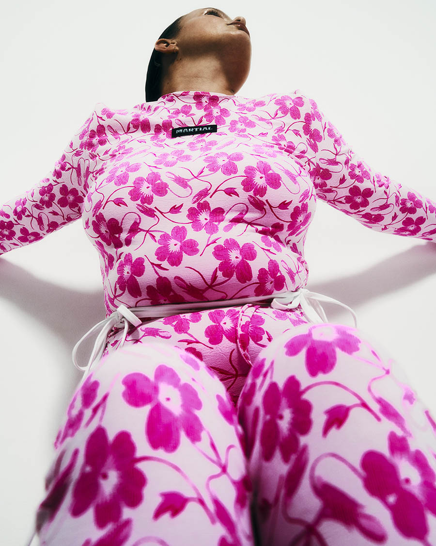

This is the second season of your innovation swimwear brand; it is nascent but full of potential as we can see. Could you guide us through the concept and the mood of your second season’s design?
Actually, I regard this second drop as a teaser, the teaser for my next spring summer collection. I reveal new colors (sky blue, khaki…), a more urban vibe because my pieces are designed to be worn also in town or for partying; and together with jeans, under a transparent dress…and so on. It is also an opportunity to present my first unisex ready-to-wear set composed of a top and pants.
As an extension of the first season, what was the connection that you link the two seasons’ design?
Exactly, it is an extension of my first collection, I take emblematic models from the first collection in new colors. As for my first ready-to-wear set, it uses a floral jacquard fabric from my first collection. I also wanted to keep the same guideline of my first collection; the contrasting lacing and the color mixes.

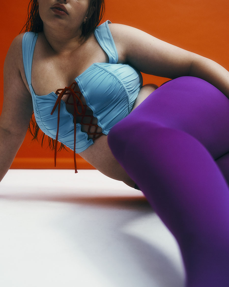
Genderless swimwear is still quite a new concept today, but with the awareness of non-binary gender self-identity rising, it is nice to see someone initiate the moves and produce genderless swimwear in the market. What makes you decide to initiate this move?
It was my personal story that naturally pushed me to embark on this adventure. Since childhood I have always had a pronounced taste for androgynous figures. My wardrobe is also composed of many “feminine” clothes. Unfortunately, they are not always well-fitted for a male body. From this observation and experience, I initiated the idea to find solutions of abolishing the gender boundaries.
Continuing from the previous question, who are the existing clients of your genderless swimwear, and who will the potential clients be?
I believe and imagine my customers to be those who are the real spearheads to break the gender boundaries. They are looking for pieces that allow them to feel comfortable, whether the anatomy agree with their gender or not.

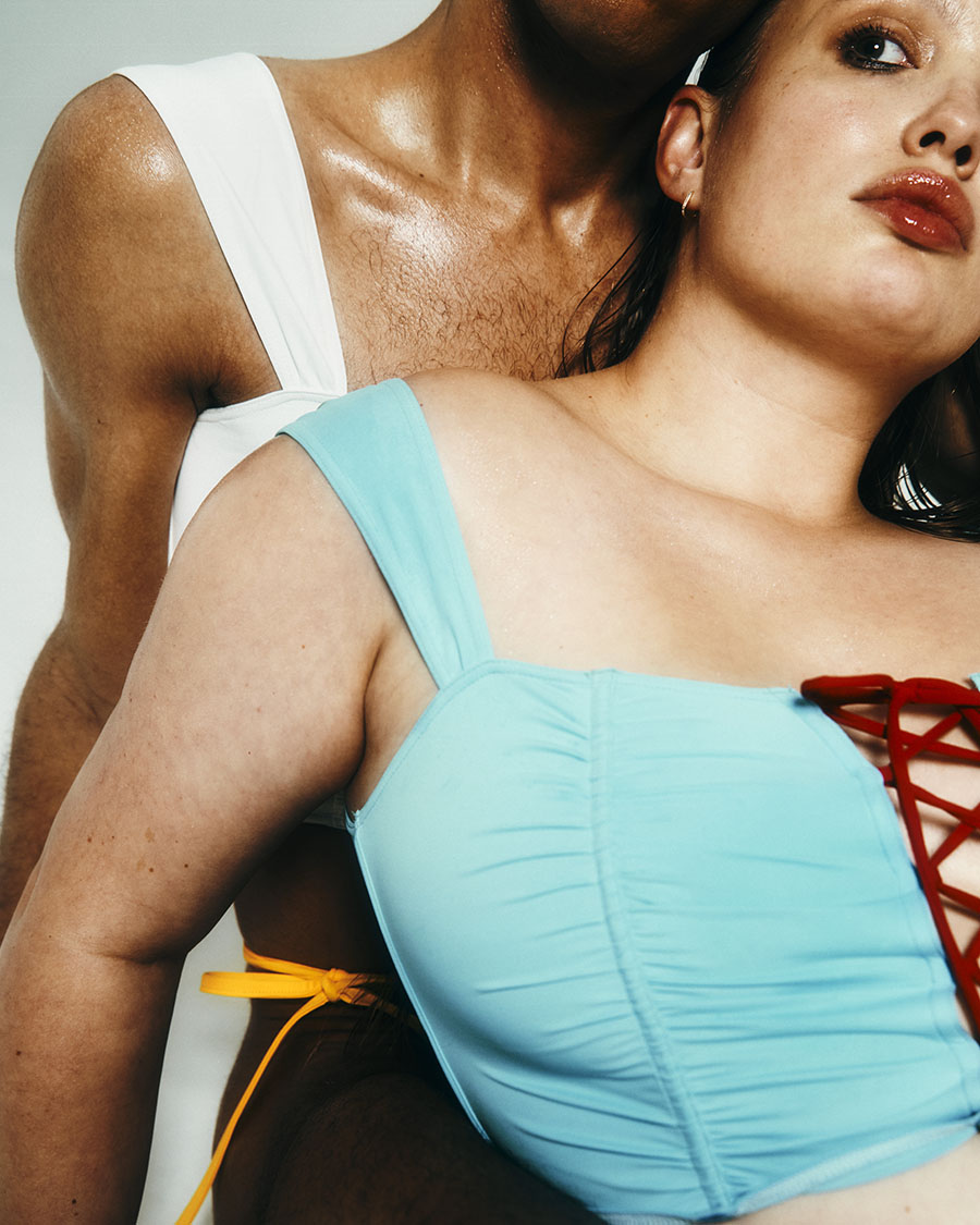
Normally when we talk about unisex design, we are talking about ready-to-wear outfits. It is not common to have genderless design in intimate wears. How do you cross the biological characteristics and eliminate the boundaries while respecting the anatomy?
Indeed, that was the main challenge, we cannot deny the anatomical differences even if we want to. Also, most of unisex clothes on the market are using oversize shape to overcome the biological difference, and it is impossible for a swimsuit to follow suit. This is the reason why each model of our swimwear has two patterns taking into account the anatomical characteristics of each gender. We want to offer upshots that are visually identical, regardless of the morphological characteristics of the model. It was therefore necessary to find solutions at the pattern stage, to finally create the illusion of a single model.
As an emerging brand, how do you position your brand in this market?
My brand is meant to question a new relationship around our body, our sexuality but also our identity. The borders initially established by the society have never been so fragile, and that’s a good thing! This is with a genderless swimwear world that I wanted to definitely break the codes.
Could you share with us some insight in your next season’s project if it is not a business secret?
Of course, it is a business secret haha. But what I can tell you is that I am currently working on various accessories and bags on top of the swimwear. Moreover, I want to mainly offer more ready-to-wear. On top of that I want to confection some extravagant image pieces with unexpected materials…SO GUYS, STAY TUNED!
Photography: Enzo Tonati (@je_sors_ce_soir_)
Creative Direction: Julie Etienne des Rosaies (@julieetiennedes)
Styling: Taoriki Dexter (@toarikidexter)
Casting: Chouaïb Arif (@chouaibarif_casting)
Hair: Vincent Yves-Marie Zimberlin (@vincentzimberlin)
Make up: Azusa Kumakura (@azusabeauty_)
Photo Assistant: Soraya Sanini (@sosoinpariss), Jacky Varlet (@jackyonacid)
Model : Julia-Kim (@julikimjean), Rose (@rrrabia__), Ritchy Oricci (@ritchycobraldelavega)
Interview by Yves Tsou
These Four Walls


dress KLAESI HOLDENER, top DION LEE, pants WOLFORD, boots JIL SANDER

jumper MM6 MAISON MARGIELA, skirt KHAITE, denim & boots JIL SANDER


dress KLAESI HOLDENER, shoes MIU MIU

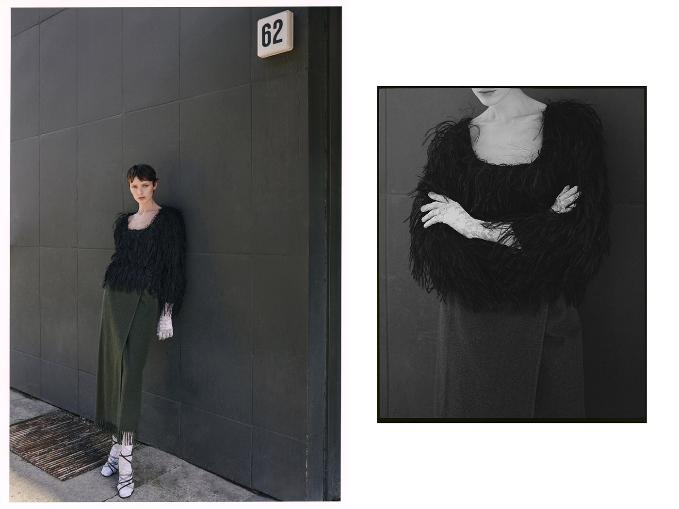
top KLAESI HOLDENER, bodysuit NAOMI TARAZI, skirt RALPH LAUREN COLLECTION, shoes MAISON MARTIN MARGIELA
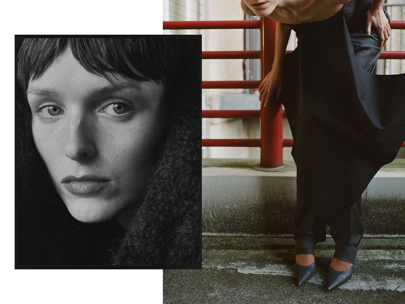

full look MA HORDE
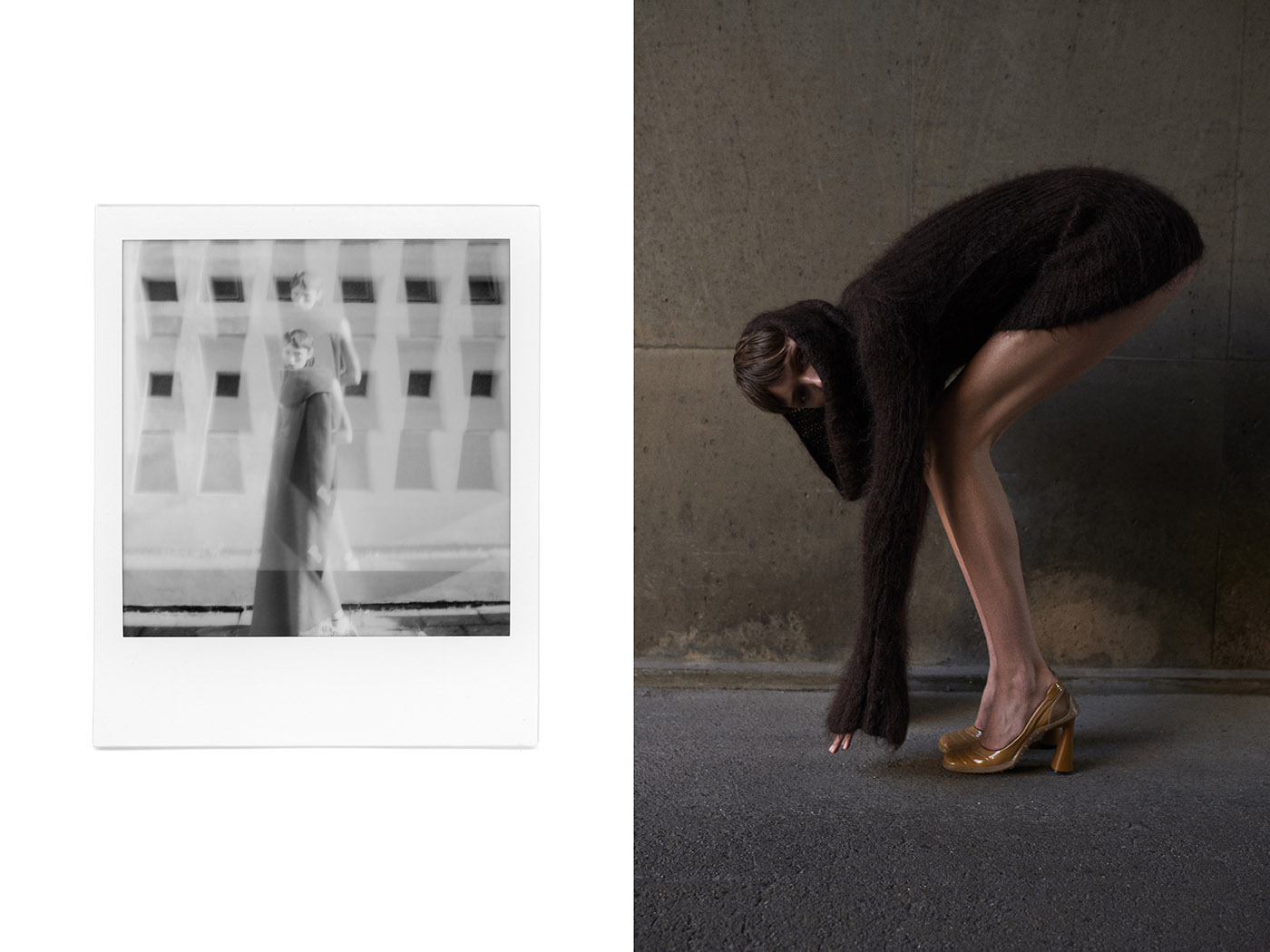
dress JUNKO SHIMADA, shoes MIU MIU

drapes ZELLWEGER WARMWEAR, tights FALKE, shoes MAISON MARTIN MARGIELA

top & pants MAISON MARTIN MARGIELA, shoes HELMUT LANG

full look MA HORDE

Photography: Maxine van Endert (@maxinevanendert)
Styling: Moritz Lindert (@moritzlindert)
Hair & Make-up: Nicola Kurdziel (@nicolakurdziel)
Model: Jada Joyce (@jada_joyce)


